Before
The original mark. The brief had evolved — the visual identity needed to catch up.
After
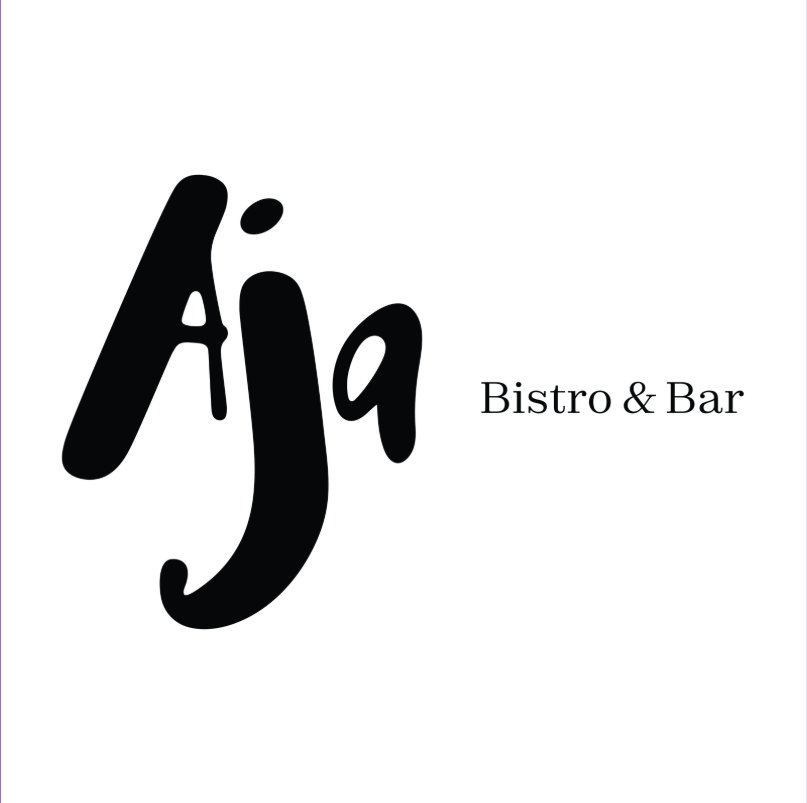
Handwritten, confident, immediately warm. A visual language built to match the room.
Brand + Concept Creation
Not just a logo. A visual and verbal system that knows what it is, what it's for, and how to behave across every surface it touches — from a sign above the door to the way a menu feels in your hand.
We start with function. What does this brand actually need to do? Who is it for, and where does it have to live? The answer to that question drives every creative decision that follows.
A brand built for a music-led bistro needs warmth, looseness, personality. A brand built to move across merchandise, fabric, and physical product needs a mark that tiles, scales, and holds its integrity at any size. These are fundamentally different briefs — and they need fundamentally different answers.
The brief tells you what the brand needs to be. Our job is to make sure the creative work earns its place by serving that brief — not working against it.
A brand isn't finished when it looks right. It's finished when it works — across every touchpoint, in every context, without anyone having to explain it.
Selected Work
The original mark. The brief had evolved — the visual identity needed to catch up.
Handwritten, confident, immediately warm. A visual language built to match the room.
A Different Brief — A Different Answer
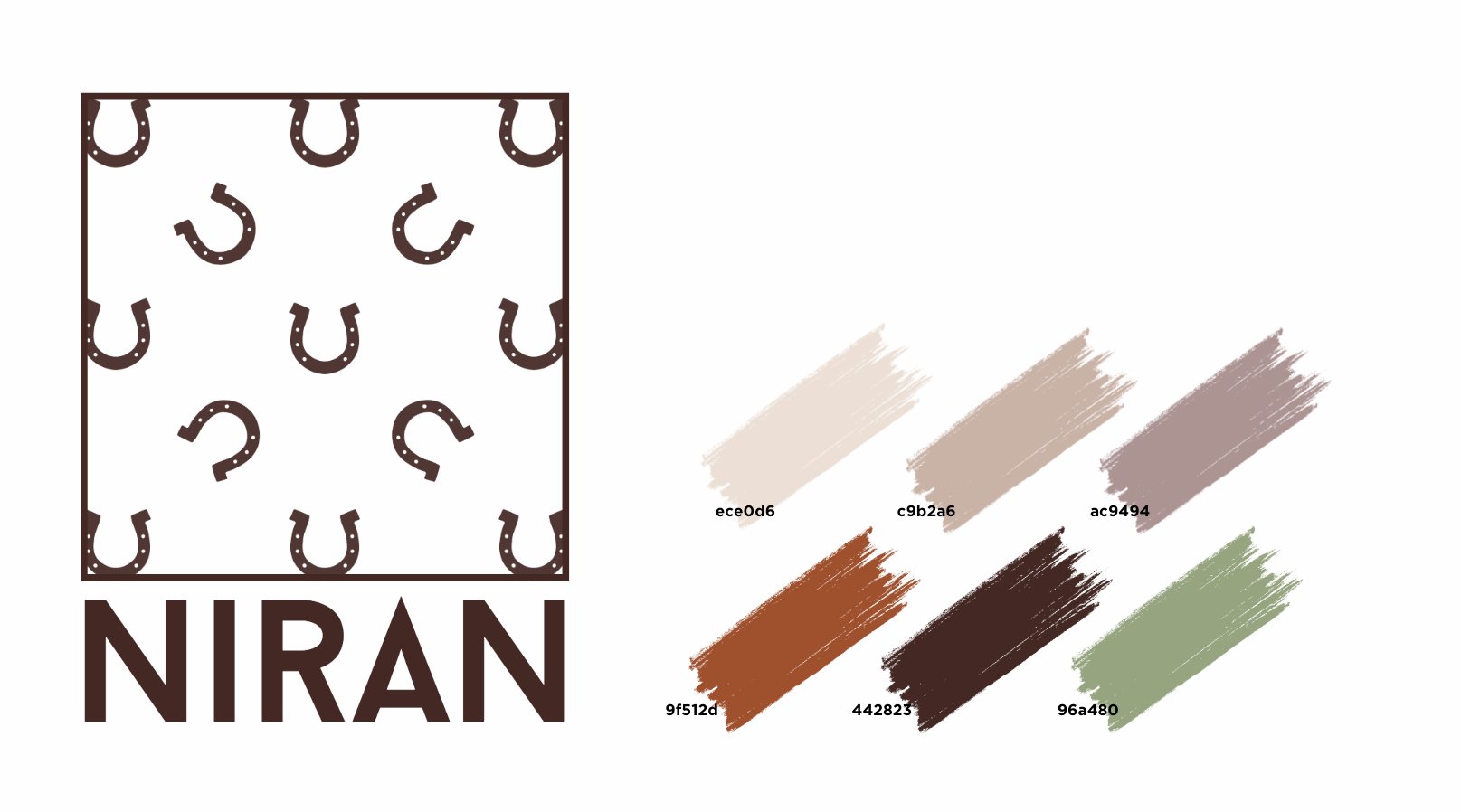
When the brief is a brand that has to live across physical product — fabric, merchandise, uniforms, equestrian equipment — the mark itself has to be designed for that from the start.
Three directions were developed and presented. The selected route was chosen for its range: a repeating tile motif that works as a standalone mark, tiles across a surface, or breaks into a pattern without losing its integrity. Scalable from a digital header to an embroidered saddle pad.
The palette was built for the same reason — warm earth tones that read well on linen, leather, and natural materials. A font system that holds up at small sizes on labelling and signage.
The result is a brand with genuine range. One that was designed to travel from the moment the brief was written.
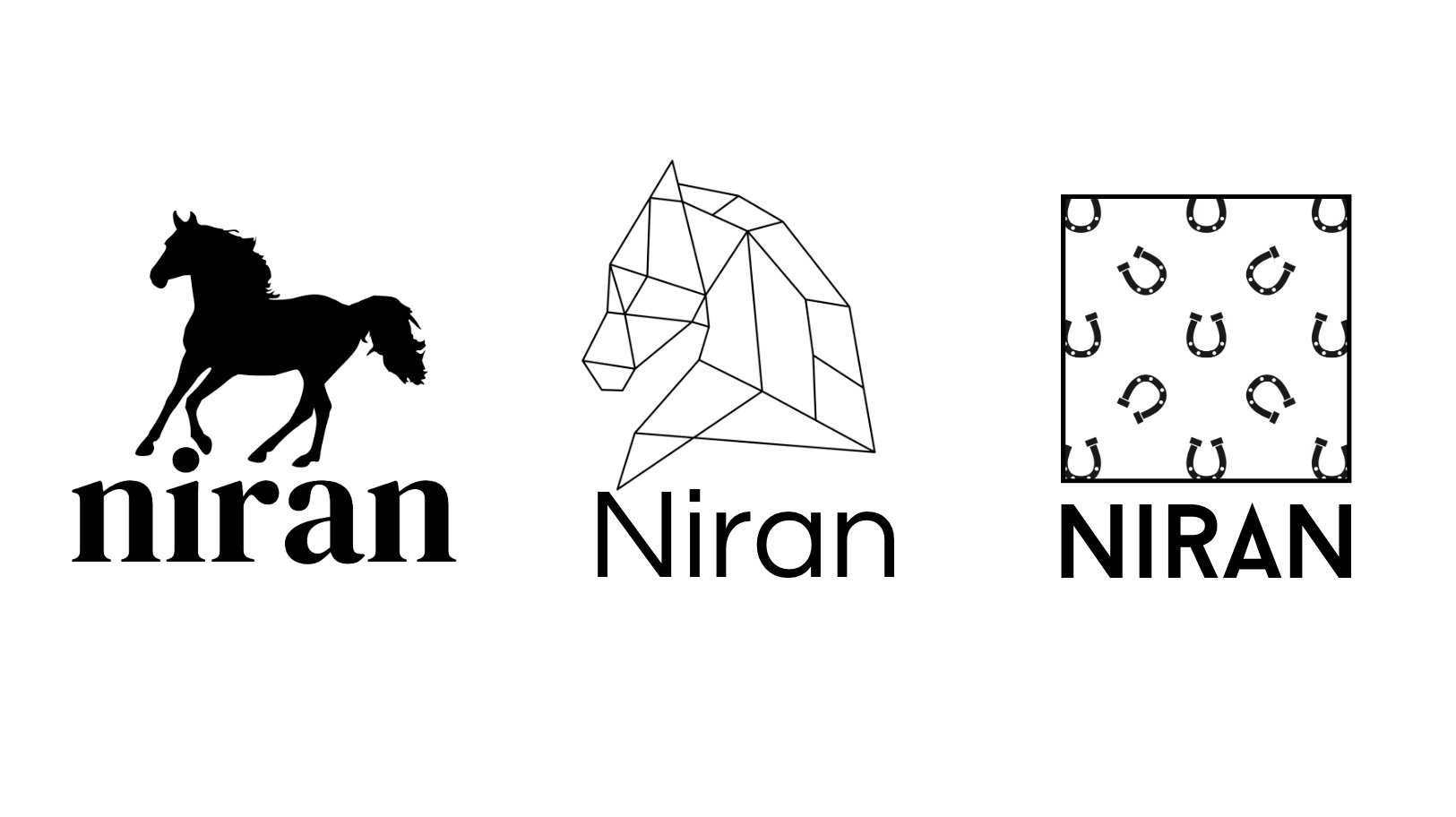
Two briefs. Two completely different answers. That's what brand work should be.